
This article covers Bootstrap v5.
Angular Material is a set of high-quality UI components that implement Google's Material Design. It's built with and for Angular. The library is great and keeps getting better with time. But, in my humble opinion, it lacks some important features like a decent layout (grid) system, a CSS reset, and some CSS utilities that ease our life as developers.
In this article, you will learn how to mitigate those issues by adding the best parts of Bootstrap to Angular Material:
- Bootstrap Reboot: a solid CSS foundation with better browser defaults.
- Bootstrap Grid: a powerful responsive grid system.
- Bootstrap Utilities: tons of CSS utility classes that will ease your life.
If you want to learn more about why I think it's a good idea to combine Angular Material and Bootstrap, check out my video from the NG-DE conference where I dig deeper into the rationale behind this decision.
https://youtu.be/6MgOHuxz2Ow
Because Bootstrap is modular and built with Sass, you can add to Angular Material the parts you need very easily without importing the whole Bootstrap library. Let's get started!
Installing Bootstrap
First, add Bootstrap to your dependencies using npm:
npm install bootstrap --save
Bootstrap Reboot
The first thing to pick from Bootstrap is Bootstrap Reboot.
What is Bootstrap Reboot?
All browsers have presentation defaults, but no browser has the same defaults.
—Eric Meyer, creator of CSS Reset
Bootstrap Reboot, a fork of Normalize.css, is the reset styles that come with Bootstrap. Its goal is to remove inconsistencies between the different browsers, but also to provide better defaults. I won't go over the details of what's included in Bootstrap Reboot, but here are some improvements it brought:
- The use of
box-sizing: border-boxfor all elements. - The use of
remsinstead ofemsfor some browser defaults. - The removal of elements'
margin-topto prevent collapsing margins.
You can find more information about Reboot on the Bootstrap documentation.
Adding Bootstrap Reboot
To add Bootstrap Reboot to your application, open your global stylesheet (src/styles.scss) and add the following Sass imports:
// Import functions, variables, and mixins needed by other Bootstrap files
@import "~bootstrap/scss/functions";
@import "~bootstrap/scss/variables";
@import "~bootstrap/scss/mixins";

// Import Bootstrap Reboot
@import "~bootstrap/scss/root"; // Contains :root CSS variables used by other Bootstrap files
@import "~bootstrap/scss/reboot";
Here's the result:
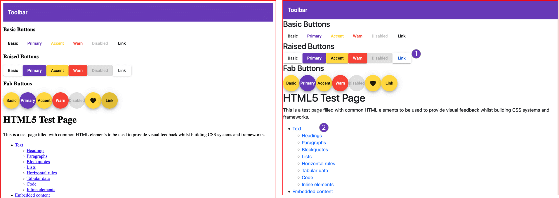
On the left, our example before adding Reboot; and on the right, the same example after adding Reboot. As you can see, Reboot has removed the margins on the <html> element, which is great. Unfortunately, Bootstrap Reboot has introduced some styles that we do not want:
- The color of Angular Material's anchor buttons is now blue.
- Normal links are also blue—the default primary color in Bootstrap.
Fixing Reboot issues
To fix these issues, create two Sass partials and import them in the global styles.scss file:
src/styles/_variables.scss: before importing Bootstrap variables.src/styles/reset.scss: after all Bootstrap imports.
@import "styles/variables";

@import "~bootstrap/scss/functions";
@import "~bootstrap/scss/variables";
@import "~bootstrap/scss/mixins";
@import "~bootstrap/scss/root";
@import "~bootstrap/scss/reboot";

@import "styles/reset";
_variables.scss
The _variables.scss Sass partial allows you to customize Bootstrap—more precisely, the parts of Bootstrap that you will be using. You added it before importing the Bootstrap variables to make Bootstrap use your custom values instead of its default values.
Bootstrap default values are defined in the~bootstrap/scss/variablesfile. For instance,$link-color: theme-color("primary") !default;. Open that file to learn more about what you can customize in Bootstrap.
Here's the content of the _variables.scss partial:
$link-color: #673ab7; // 1
$label-margin-bottom: 0; // 2
- Sets your links color to your primary color (
#673ab7) as per the Material Design specification. You can use your secondary color if you prefer. - Sets the
$label-margin-bottomto zero to remove themargin-bottomfrom the<label>HTML element.
reset.scss
The reset.scss Sass file allows you to override some of the Bootstrap styles you don't want. That's why you've added it after all Bootstrap imports.
a {
  &.mat-button, &.mat-raised-button, &.mat-fab, &.mat-mini-fab, &.mat-list-item {
    &:hover {
      color: currentColor
    }
  }
}
For Angular Material anchor buttons—those have one of the following classes: .mat-button, mat-raised-button, mat-fab-button, mat-list-item—you've stopped Bootstrap Reboot from changing the color of the text on hover. You did so by resetting the color on hover to the currentColor meaning the one set by Angular Material.
Bootstrap Grid
Bootstrap’s grid system uses a series of containers, rows, and columns to layout and align content. It’s built with flexbox and is fully responsive.
Adding the Bootstrap grid system to our Angular Material application is a simple as adding two Sass imports in your styles.scss file:
@import "styles/variables";
@import "~bootstrap/scss/functions";
@import "~bootstrap/scss/variables";
@import "~bootstrap/scss/mixins";
@import "~bootstrap/scss/root";
@import "~bootstrap/scss/reboot";

@import "~bootstrap/scss/containers"; // Add .container and .container-fluid classes
@import "~bootstrap/scss/grid"; // Add the grid system

@import "styles/reset";
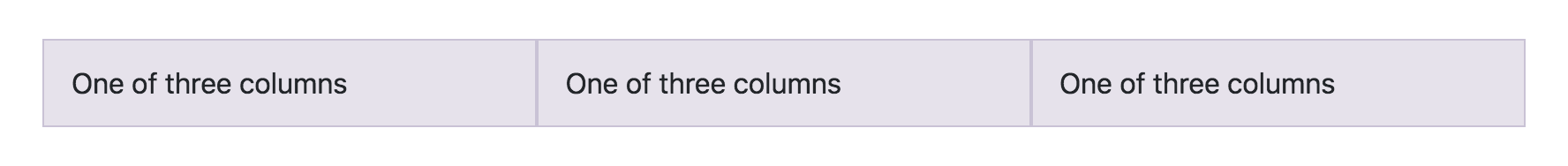
Now you can use the grid in your components:
<div class="container">
  <div class="row">
    <div class="col">
      One of three columns
    </div>
    <div class="col">
      One of three columns
    </div>
    <div class="col">
      One of three columns
    </div>
  </div>
</div>
The Bootstrap grid is fully responsive. For example, if you want a column to take 4 units on large devices, 8 units on medium devices, and 12 units on small devices, add the following three classes to your container:
.col-lg-4.col-md-8.col-sm-12
The Bootstrap Grid is also fully customizable. For example, you can change:
- The number of grid tiers (
$grid-breakpoints). - The number of columns (
$grid-columns, default to 12). - The column gutter width (
$grid-gutter-width, defaults to1.5rem).
For instance, to use Material Design breakpoints, you can add the following piece of code to the _variables.scss file:
$grid-breakpoints: (
  xs: 0, // handset portrait (small, medium, large) | handset landscape (small)
  sm: 600px, // handset landscape (medium, large) | tablet portrait (small, large)
  md: 960px, // tablet landscape (small, large)
  lg: 1280px, // laptops and desktops
  xl: 1600px // large desktops
);

$container-max-widths: (
  sm: 600px,
  md: 960px,
  lg: 1280px,
  xl: 1600px
);
If you want to learn more about the Bootstrap Grid system, check out the Bootstrap documentation.
Bootstrap Utilities
A utility class is typically a single, immutable property-value pairing expressed as a class (e.g.,.d-blockrepresentsdisplay: block;). Their primary appeal is speed of use while writing HTML and limiting the amount of custom CSS you have to write.
Bootstrap includes hundreds of CSS utility classes for dealing with spacing, positionning, sizing, alignment, font weight, flex containers, flex items, etc. The documentation is really neat, and covers all the great stuffs you can do. In this article I will just show you a gist of it.
Spacing utilities
To assign margin/padding to an element, add a class respecting the following format:
{property}{sides}-{size} for xs, and {property}{sides}-{breakpoint}-{size} for sm, md, lg, and xl breakpoints.
property is one of:
m- for classes that setmargin.p- for classes that setpadding.
sides is one of:
t- top.b- bottom.s- (start) left in LTR, right in RTL.e- (end) right in LTR, left in RTL.x- left and right.y- top and bottom.- blank - top, right, bottom, left.
size is one of:
0-$spacer * 01-$spacer * .252-$spacer * .53-$spacer * 14-$spacer * 1.55-$spacer * 3auto-auto
The default value of $spacer is 1rem. As you may have guessed, you can customize it to fit your needs by setting the desired value in the _variables.scss file.
Flexblox utilities
Bootstrap Flexbox utility classes help you change the properties of flex containers and flex items.
display: to make an element a flex container.d-flexfordisplay: flex;..d-inline-flexfordisplay: inline-flex;.flex-direction: to specify the direction of the main axis.flex-rowforflex-direction: row;..flex-row-reverseforflex-direction: row-reverse;..flex-columnforflex-direction: column;..flex-column-reverse forflex-direction: column-reverse;.flex-wrap: to specify whether flex items will wrap or not to a new line.flex-wrapforflex-wrap: wrap;.flex-nowrapforflex-wrap: nowrap;.justify-content: to control how items are positioned along the main axis..justify-content-startforjustify-content: flex-start;..justify-content-endforjustify-content: flex-end;..justify-content-centerforjustify-content: center;..justify-content-space-betweenforjustify-content: space-between;..justify-content-space-aroundforjustify-content: space-around;.align-items: to control how items are positioned along the cross axis..align-items-startforalign-items: flex-start;..align-items-endforalign-items: flex-end;..align-items-centerforalign-items: center;..align-items-baselineforalign-items: baseline;..align-items-stretchforalign-items: stretch;.- etc.
All these classes have their responsive variants. For example:
.d-sm-flex..justify-content-lg-center..align-items-lg-baseline.
To be able to use these Bootstrap utilities, you must add the corresponding imports to your main Sass file.
@import "styles/variables";
@import "~bootstrap/scss/functions";
@import "~bootstrap/scss/variables";
@import "~bootstrap/scss/mixins";
@import "~bootstrap/scss/root";
@import "~bootstrap/scss/reboot";
@import "~bootstrap/scss/containers";
@import "~bootstrap/scss/grid";

@import "~bootstrap/scss/utilities"; // Configures the utility classes that should be generated
@import "~bootstrap/scss/utilities/api"; // Generates the actual utility classes

@import "styles/reset";
Summary
Angular Material is a great UI component library. But it lacks some important features like a layout system, a CSS reset, and some CSS utilities. Fortunately, we can very easily "steal" those features from Bootstrap—a modular, and well-designed component library. This can be a very good starting point for building high-quality Angular applications.
If you enjoyed this article, follow @ahasall on Twitter for more content like this.